skip to main |
skip to sidebar


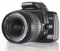
My Camera... a canon 400D dSLR

Thank you Megha ! ( http://arthandnitya.blogspot.com/)
About Me

- ~ ॐ ~
- One man... many roles... the tea-vendor, the talk-err, the listen-err, the silence-err, the fotograph-er, the learn-err, the preach-err, the practition-err, the sin-err, the believ-err, the bugg-err, the crib-err, the dream-err, the travel-err, Hoping to keep life fresh... like my favorite cuppa tea !!!
People at the Studio !
MuRaRiLaaL

My Camera... a canon 400D dSLR
Awards !

Thank you Megha ! ( http://arthandnitya.blogspot.com/)


looks like a scene from a holywoodesque war-time movie
ReplyDeletei wonder how would this look in its original colours.
ReplyDelete@ burf : there is not much of colour in the original foto actually...
ReplyDeleteAwesome. I have a special affinity for modern day subjects treated in sepia.
ReplyDelete~ Arun
@ Arun :
ReplyDeleteThanks... also do let me know how u think the foto could have been better... thanks again..
I am compulsive amateur at photography Prashant. I started 'serious' (if I can say that) just 10 days back so I am really the wrong person to give any advice on the subject. But purely from the perspective of a visual communication professional, for me, the the picture really lacks nothing.
ReplyDelete~ arun
But now that you se me thinking, I would have loved to see the branding of the tyre (Bridgestone, MRF, Goodyear) as well in the picture along with the branding of the camera. But still, that's a subjective preference.
ReplyDelete~ a
@ Arun : :) there you go.. i knew something would come up... i actually was thinking that i could have managed to get the word GoodYear better.... u can see the faint impression on the tyre towards the right of the alpabets "OOD and YE"...
ReplyDeletei had taken this pic from a distance.. with a good amount of zoom... isliye did not think about it at that time...
thanks Arun.. i really appreciate the thought..
Yup! I just noticed the branding now you mention it. But, a great shot nonetheless!
ReplyDelete~ Arun
WOW ..jus a few day that i didn't checked ur blog and so much has happened already..
ReplyDelete.
nice shot!
m learning...
@ Arun : Thank you :)
ReplyDelete@ Sethi : thanks d00d... we all are learning...
i guess this one is where you are sitting besides the type - the pic posted on rightmore.blog*spot
ReplyDeleteis it?
tyre*
ReplyDeleteyeah it looks better without the colours!
ReplyDeletepretty! :)
@ burf :
ReplyDeleteyes... i was keeping my cam there.. and then went to the other side of the road to take the snap...
@ bastm :
thanks...
excellent composition ...... i wud have loved it more if camera was facing in front.....
ReplyDelete@ deeps...
ReplyDeletethanks man !!! point noted.. will be kept in mind...
Best regards from NY!
ReplyDelete» » »